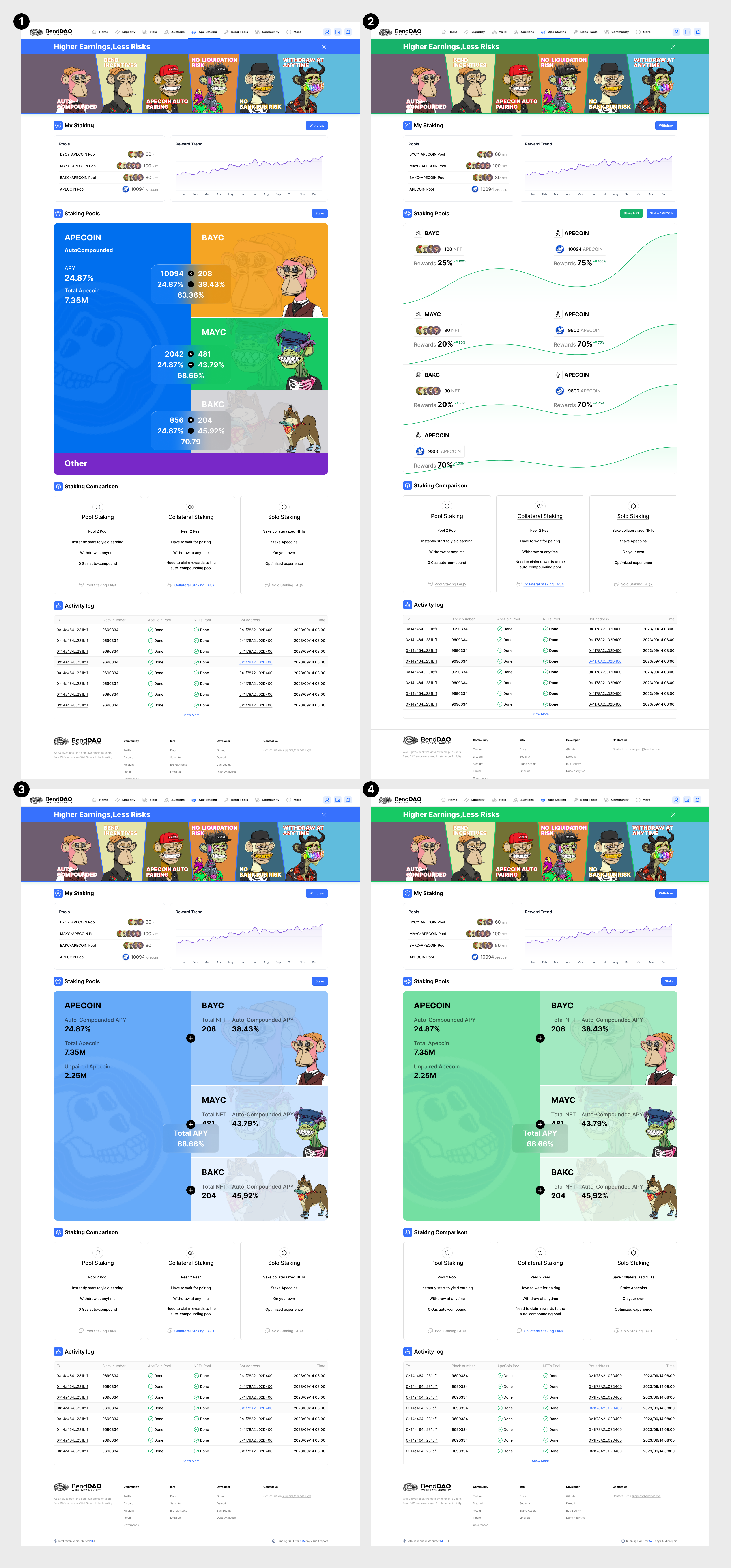
We propose that a rebranding for the BendDao website is necessary for clarity and user experience. To take a small step first, we suggest that we redesign the subpage for Ape staking.
Design Principles
Clarity
Eliminate ambiguity. Enable people to see, understand, and act with confidence.
Efficiency
Streamline and optimize workflows. Intelligently anticipate needs to help people work better, smarter, and faster.
The Solution
The new design aligns with the design principles, aiming to eliminate ambiguity, optimize workflows, and visualize data.
-
Remove the left navigation bar and integrate all information into one page.
-
The product advantages are placed at the top and can be folded.
-
My staking is placed in the most obvious position to facilitate users to check their income and perform Withdrawal operations.
-
Staking pool displays key data and information in a more vivid and interesting form.
-
Redirect users to other pools using Feature Comparison.
-
Organize the footer to make it easier for users to obtain the information.
The following are four versions of the staking pool design and theme color selection.
Budget
Product Manager @Olivia + UI designer @churb total: 500,000 BEND
Other possible budget:
-
UI Library
-
Front-end engineer
More
We are willing to design the landing page and even the whole site if users in the community approve of our style and principles.[poll type=regular results=always chartType=bar]
- 1
- 2
- 3
- 4
- None
0 voters